Visier
How might we redesign Visier Studio’s Mapping page to drive adoption and transition users from the legacy platform?
Role
UX Designer, Co-Op
Period
2022
Team
Visier Studio
As a UX Designer Co-Op at Visier, I spent four months on the Studio team and four months on the Analytics team, designing client-facing enterprise solutions for data visualization and workforce insights. This project was part of my time on the Studio team, where I collaborated with designers, engineers, and product managers to streamline workflows and close key usability gaps.
What is Visier Studio?
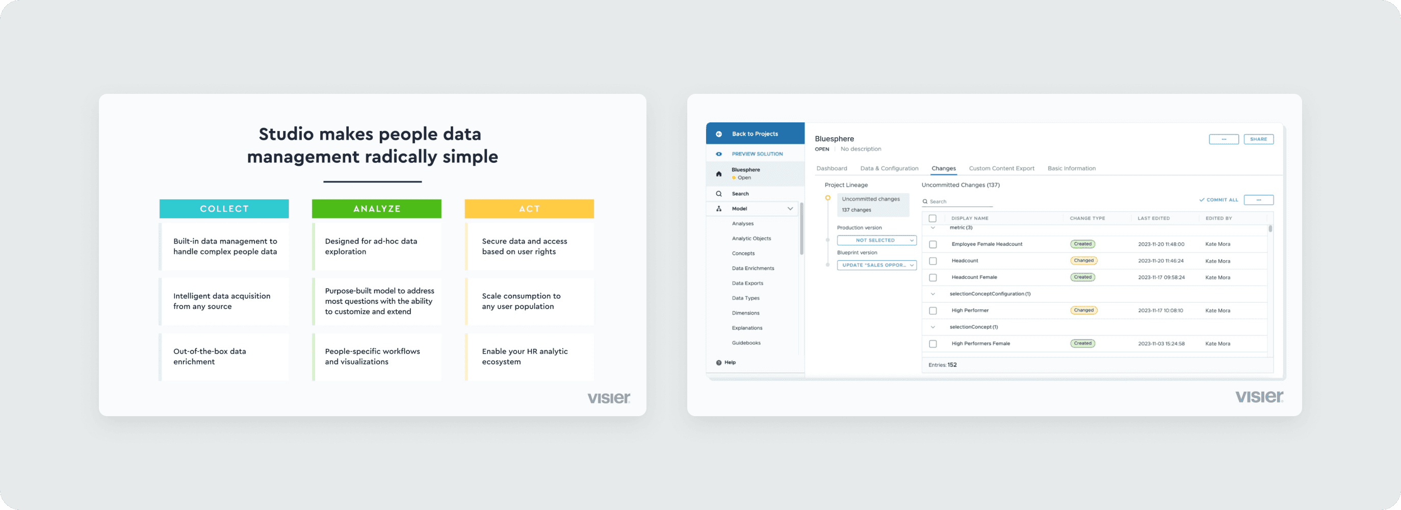
Visier Studio is a centralized hub for admins to manage data and configure content.
Studio enables admins to configure data models, mappings, and analytic objects with minimal engineering effort, making it easier for organizations to customize Visier’s analytics to fit their business needs.
Background
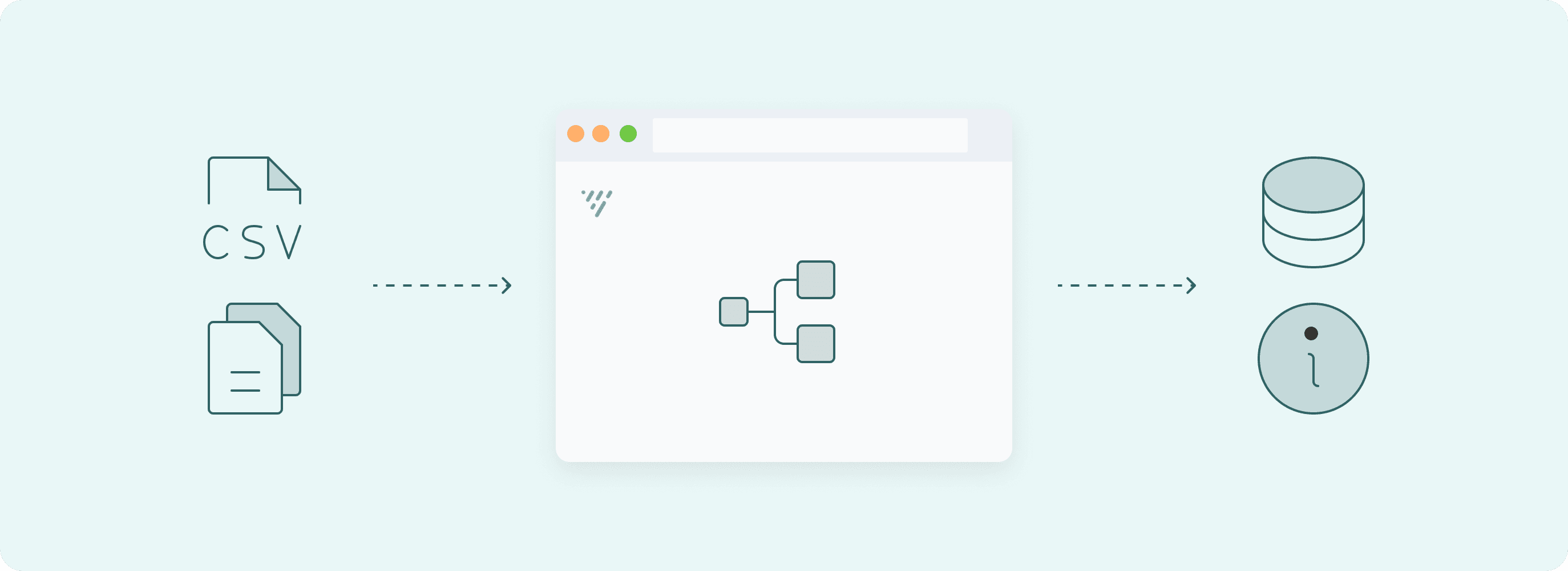
Mapping page is used to connect source data to analytic objects.
This functionality serves as the backbone for creating reliable business intelligence, allowing teams to connect disparate data sources to actionable insights.
Problem
Low adoption of the Mapping page in Studio due to usability gaps.
Despite Studio being the modern platform, internal users still favored the older, unsupported platform (called DLD) to map objects by over 70%.
Objective
Improve usability and drive adoption of the Mapping page in Visier Studio.
The goal was to close the usability gap between DLD and Studio, streamlining workflows and making Studio the preferred platform for internal users.

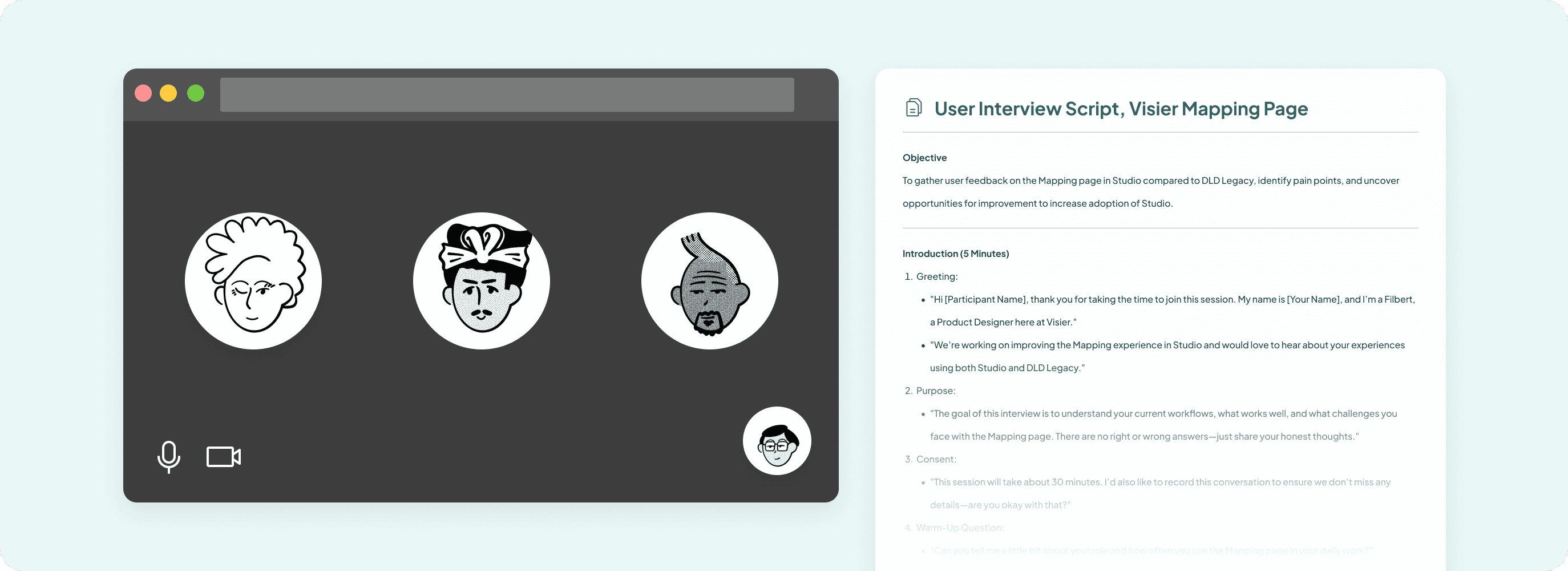
Qualitative Research
Understanding user behaviors through user interview.
We spoke with internal users to learn how they interact with the Mapping page both in DLD & in Studio, uncovering not just pain points but also workarounds, habits, and unmet needs. These insights helped us design a solution that aligns with real user workflows and reduce biases.
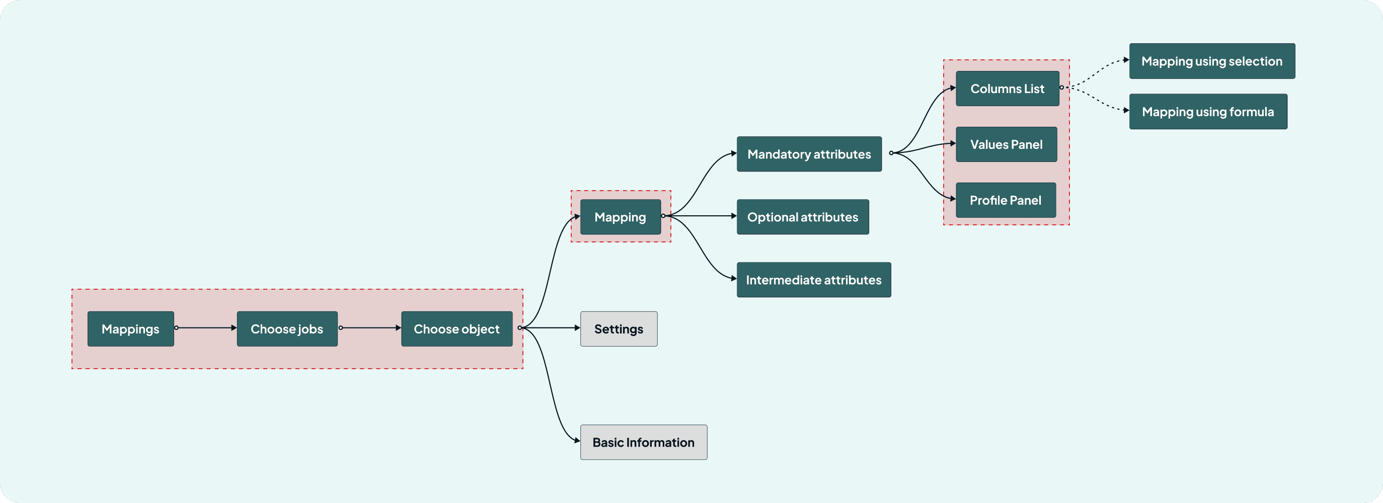
Understanding the Workflow
Mapping the user flow to identify friction points.
We analyzed how the CX team navigates the Mapping process, uncovering inefficiencies like unclear navigation and excessive steps that slowed adoption.
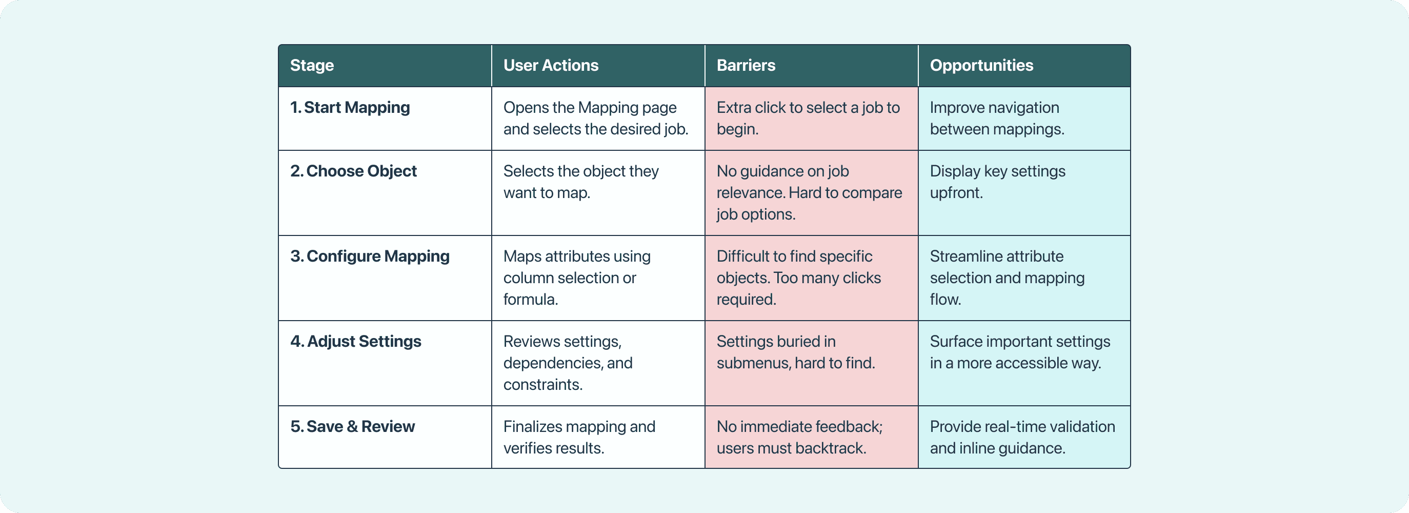
Identifying Opportunities
Journey mapping to holistically identify opportunities & barriers.
This helped us identify key opportunities to simplify navigation, surface important settings, and reduce unnecessary steps— all to make mapping more efficient.
Usability Evaluation
Understanding why users preferred the legacy platform.
DLD’s always-visible mappings, quick navigation, and upfront settings made it faster for frequent tasks. In contrast, Studio required more steps to access the same features, increasing task-completion time. This analysis helped us pinpoint which aspects of DLD’s should be integrated into Studio’s redesign.


What We Found
Slow workflows and fragmented navigation are what kept users from switching to Studio.
Excessive clicks for key tasks
Mapping objects require 4 clicks in Studio, compared to 2 clicks in DLD.
Redundant tabs and scattered navigation
Important actions are split across multiple tabs, making navigation inefficient.
Job selection inefficiency
Job selector was not easily accessible, adding unnecessary friction to the workflow.
Poor grouping of related items
Mappings, settings, and attributes weren’t logically grouped, making it difficult to locate and configure relevant data.
Key Insight
Speed and simplicity drive adoption more than feature richness.
Users completed mapping tasks ~40% faster in DLD than in Studio, averaging 15 seconds in DLD versus 24 seconds in Studio. Despite Studio offering more advanced features, many had less than 10% usage, yet still added clutter and complexity. This reveals a critical lesson— robust features don’t drive adoption if they come at the cost of task completion efficiency.
Design
Less is more: prioritizing essentials over unnecessary complexity.
We streamlined workflows by consolidating key actions and using progressive disclosure, keeping essential features upfront while hiding rarely used settings. This reduced friction, improved efficiency, and made Studio faster to use.


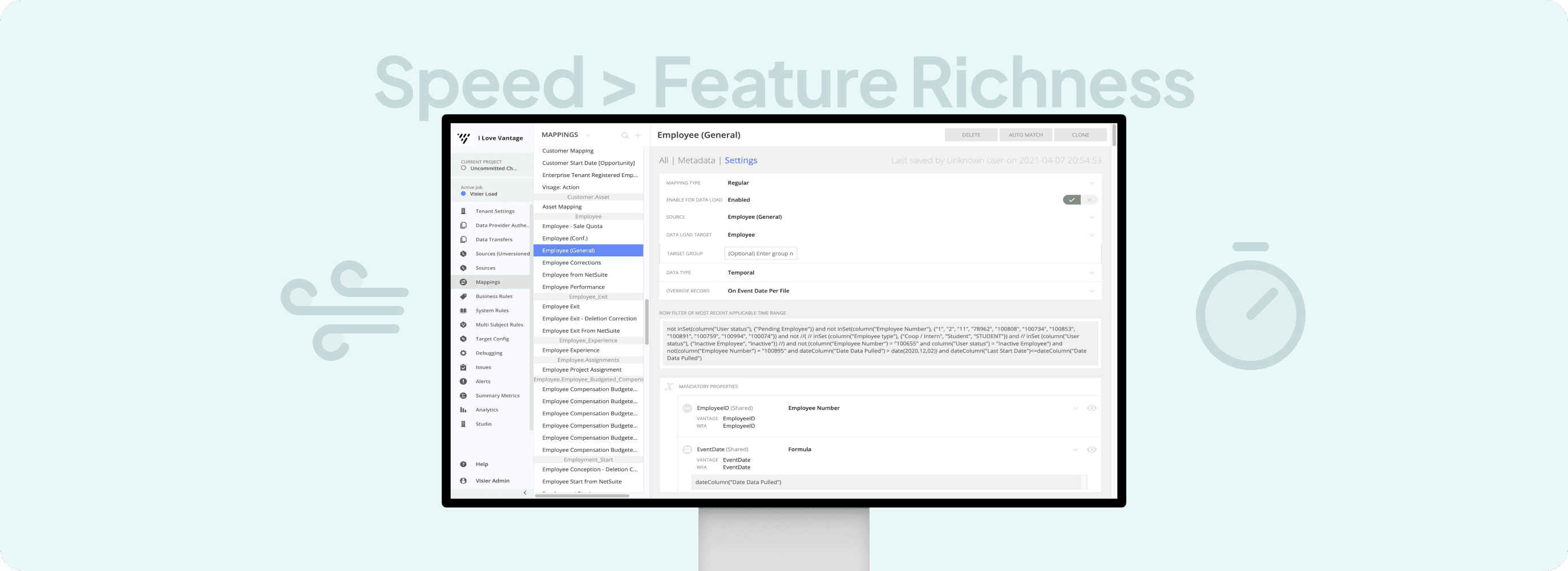
Mapping now directly accessible from the sidebar
Previously buried under multiple layers, Mapping is now a subitem under "Data”— reducing navigation time and improving discoverability.

Always-visible job selector
Converted into a dropdown to save vertical space while keeping it accessible when needed.

List for quick-switching objects
Previously, users had to switch between pages to select different objects. Now, all objects and their attributes are displayed in a structured list on the side, improving organization and accessibility.

Simplification of tab items
Reduced to 3 relevant tabs, eliminating unnecessary links to keep the focus on tasks.

Property tabs for better organization
Static information is now tucked into collapsible sections, reducing visual noise.

Streamlined mapping actions
Using progressive disclosure, secondary information is now tucked into collapsible accordions, surfacing only the most-used functions by default. This keeps the interface clean while reducing cognitive load.
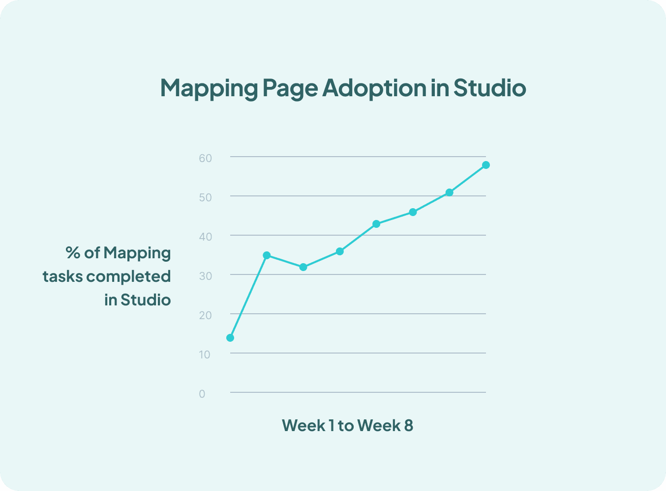
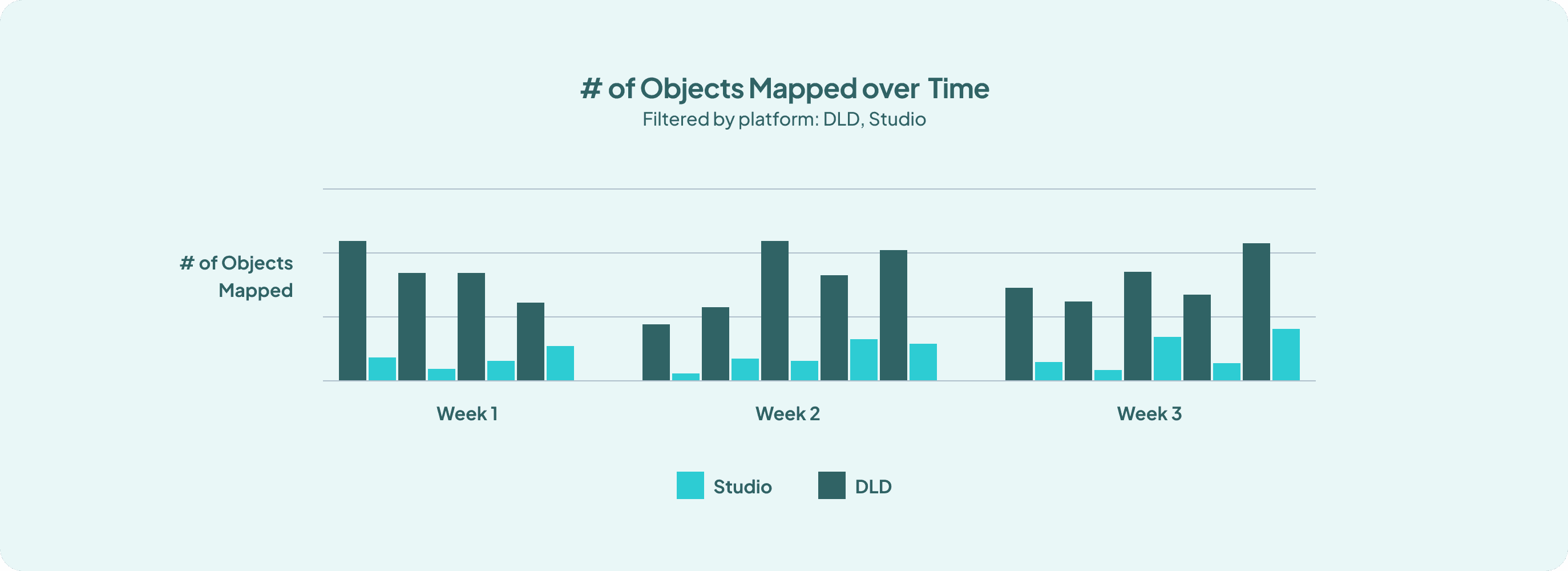
Impact
37% faster task completion and 58% increase in Mapping adoption in Studio.
Task completion time for mapping objects drop from an average of 24 seconds to 15 seconds, as measured through timed usability testing sessions. This is now on par with what DLD has. Additionally, adoption of the Mapping Page in Studio increased by 58% within two months post-launch, tracked through internal usage analytics.
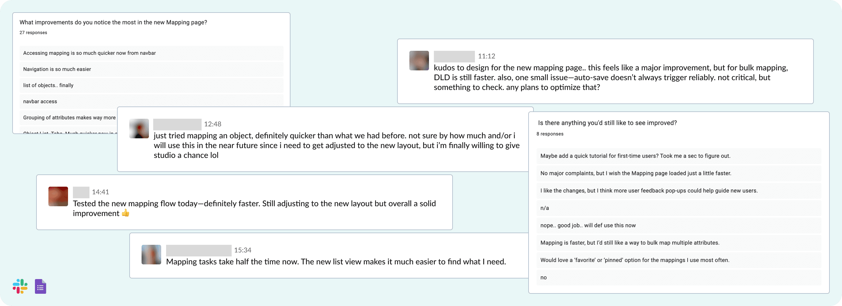
User feedback survey highlighted direct navigation bar access and revamped object list being the most praised enhancements, and possible future implementations such as pinning frequently used objects and a better onboarding experience to learn more about the new design.