Teck
How might we improve Nova’s alert color schemes to enhance accessibility for individuals with color vision deficiencies?
Role
UX Designer, Co-Op
Period
Fall 2023 - Spring 2024
Team
Design Systems Team
As a UX Designer Co-Op at Teck, I led the design of a scalable and accessible design system for Teck Digital Analytics, ensuring usability for users with diverse visual abilities. By leveraging Figma variants and variables, I created adaptable components that streamlined workflows, improved design efficiency, and ensured WCAG-compliant accessibility. This initiative not only enhanced usability but also set a foundation for future inclusive and data-driven design practices within Teck’s digital ecosystem.
Problem
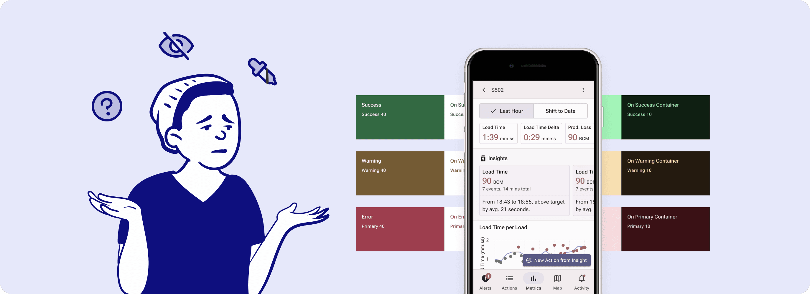
We discovered that Nova's alert colour schemes are not accessible to users with colour vision impairments.
This discovery surfaced during usability testing for a different project, revealing that individuals with visual impairments struggle with interpreting our alert colors. This issue is particularly critical in the mining industry, where alert colors are vital for immediate situational awareness and safety.
Research
Finding accessible colour systems for clarity and inclusivity.
I analyzed industry-leading design systems and accessibility standards to create a high-contrast, color-blind-friendly framework. Through landscape analysis and color experimentation, I identified key principles to enhance legibility, distinguishability, and visual hierarchy in Teck’s design system.

Establishing a framework
Landscape analysis
Testing
Validating colours against accessibility standards.
I conducted smoke testing to verify contrast ratios, color distinguishability, and real-world readability across various devices and interfaces. This process confirmed that the colors aligned with accessibility standards and effectively improved the user experience.

Contrast plugin
To verify the accessibility of our new color choices, I utilized the "Contrast" plugin, which evaluates color combinations against the WCAG's minimum contrast ratio of 4.5. This tool was instrumental in ensuring that our text remains readable against background colors, directly addressing the critical issue of visibility & readability.

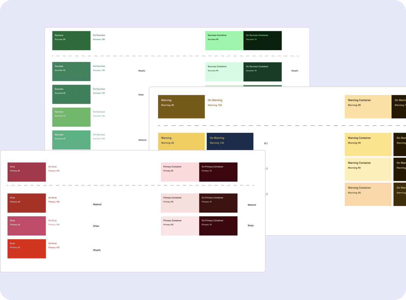
Tanaguru Contrast Finder
I leveraged Tanaguru Contrast Finder to find similar colours that fulfill the contrast requirements. This tool was invaluable in identifying alternatives whenever initial choices fell short, guiding us towards colors that both meet accessibility standards and align with our design requirements.

Sim Daltonism to simulate different types of colourblindness
Sim Daltonism allow users to see colors through the lens of various color vision deficiencies. This simulation helped us understand how our chosen colors would appear to users with different types of colorblindness, ensuring our designs are inclusive.

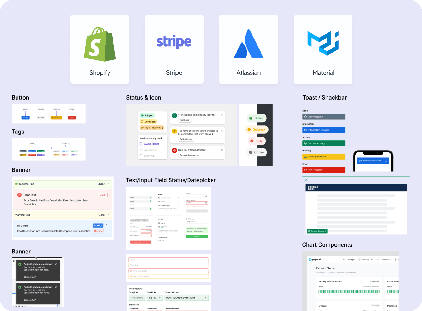
Applying the new colors to components
The final step involved integrating the colors into Nova components to assess their harmony with Teck's brand identity and visual impact across our product suite. This practical application was crucial for confirming the colors not only met accessibility standards but also enhanced the aesthetic and functional coherence of our products.
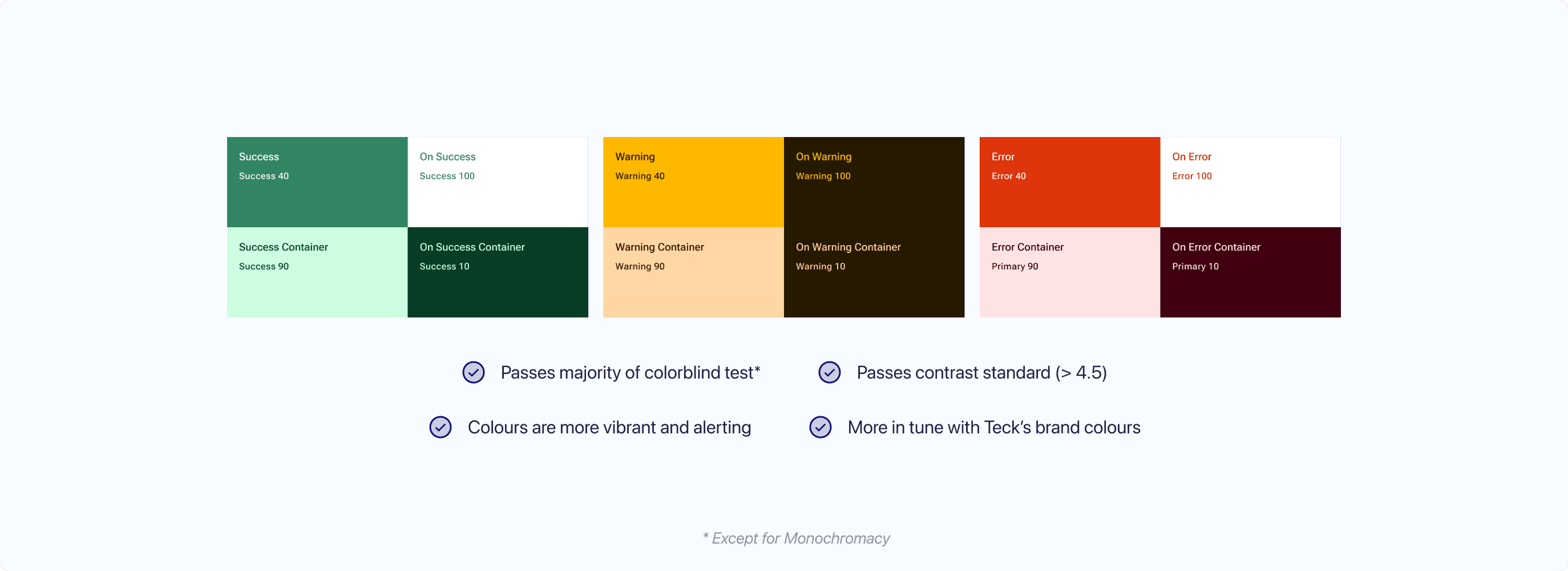
Result
Brand new palette, same brand identity.
Tabs
Tabs organize content across different screens and views. Use tabs to group content into helpful categories.

Impact
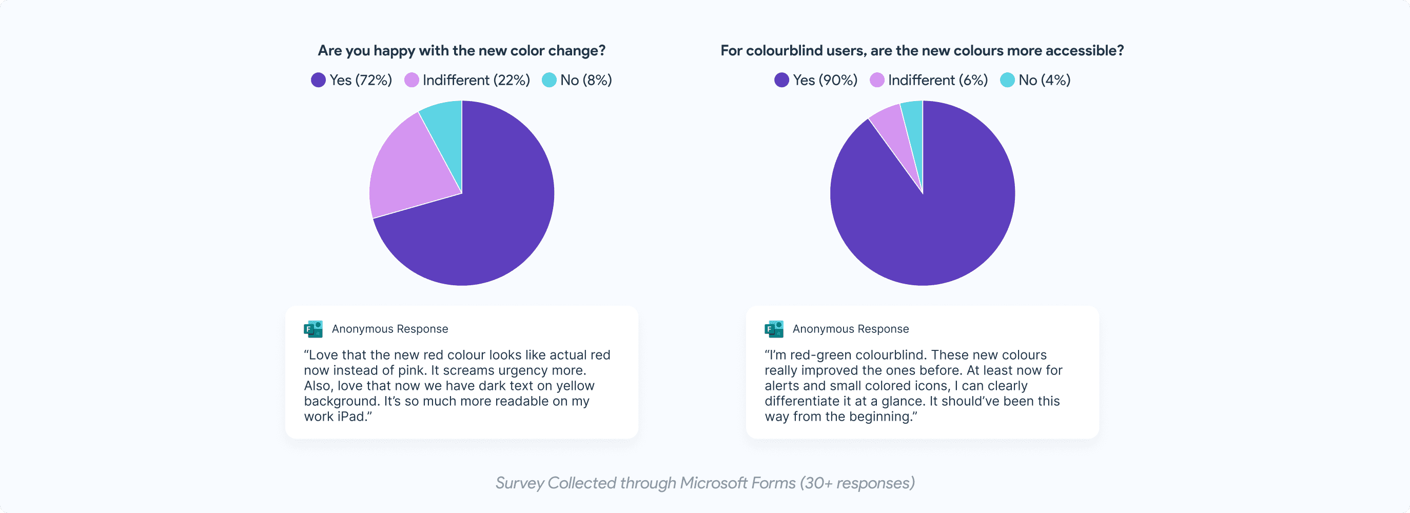
Survey confirms improved accessibility and positive reception of new colours.
Two weeks following the rollout of the new color scheme, I conducted an asynchronous surveys to gauge user reactions and gather feedback. The summarized findings revealed a positive shift in user experience, with notable improvements in color accessibility, readability, and the overall visual appeal of our interfaces.