Teck
How might we create scalable design system components for miners to navigate complex fleet data efficiently?
Role
UX Designer
Period
Fall 2023 - Spring 2024
Team
Design Systems Team
As a UX Designer at Teck, I led the design of a scalable and accessible design system for Teck Digital Analytics, ensuring usability for users with diverse visual abilities. By leveraging Figma variants and variables, I created adaptable components that streamlined workflows, improved design efficiency, and ensured WCAG-compliant accessibility. This initiative not only enhanced usability but also set a foundation for future inclusive and data-driven design practices within Teck’s digital ecosystem.
Background
Nova Design System has recently been launched and is currently evolving towards full maturity.
This design system has become an essential tool for 10+ designers working on Teck's diverse digital product portfolio.

Structure
Leveraging Atomic Design to maintain scalability in the design system.
This methodology enables us to build consistency and scalability across Teck's digital ecosystem, from the smallest unit to complete pages.

Atoms


Process
Analyze → Research → Design → Review → Validate. Repeat.
Scope possible use cases on Teck’s various product suites
This exploration was important in grasping the reasons behind the design of the components and their intended applications.

Using Material 3 as the North Star and other established design systems as secondary inspiration
This approach guaranteed that the behavior and interaction of our components would seamlessly integrate with the development framework, fostering consistency across our products.
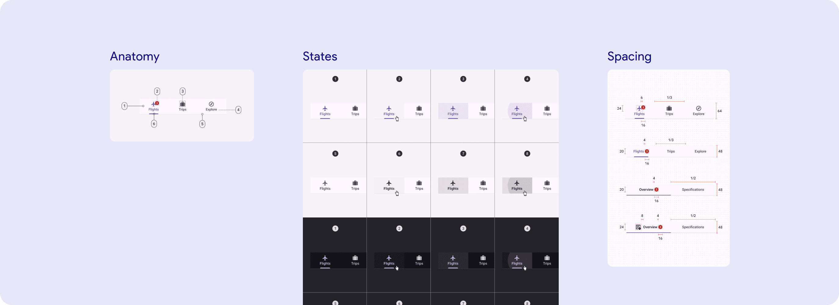
Defining the base specifications
When defining component specifications, I closely adhered to Google's Material 3 Design Kit, utilizing it as our blueprint to ensure our components' behavior and interactions mirrored the front-end framework.
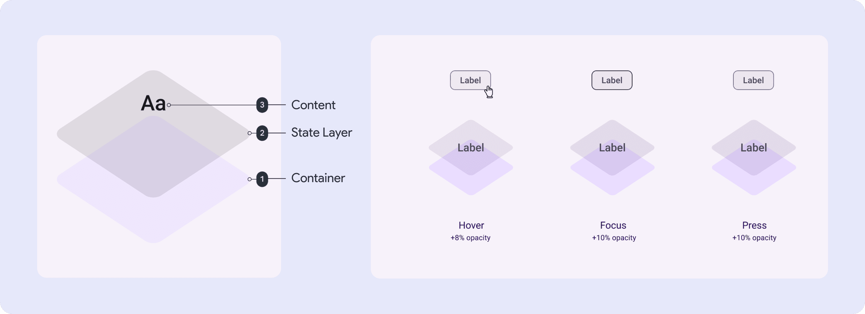
Applying state layer interactions
A state layer is a semi-transparent covering on an element that indicates its state and provides a systematic approach to visualizing states by using opacity. This method ensures designers can effectively communicate the status of components during handoffs.
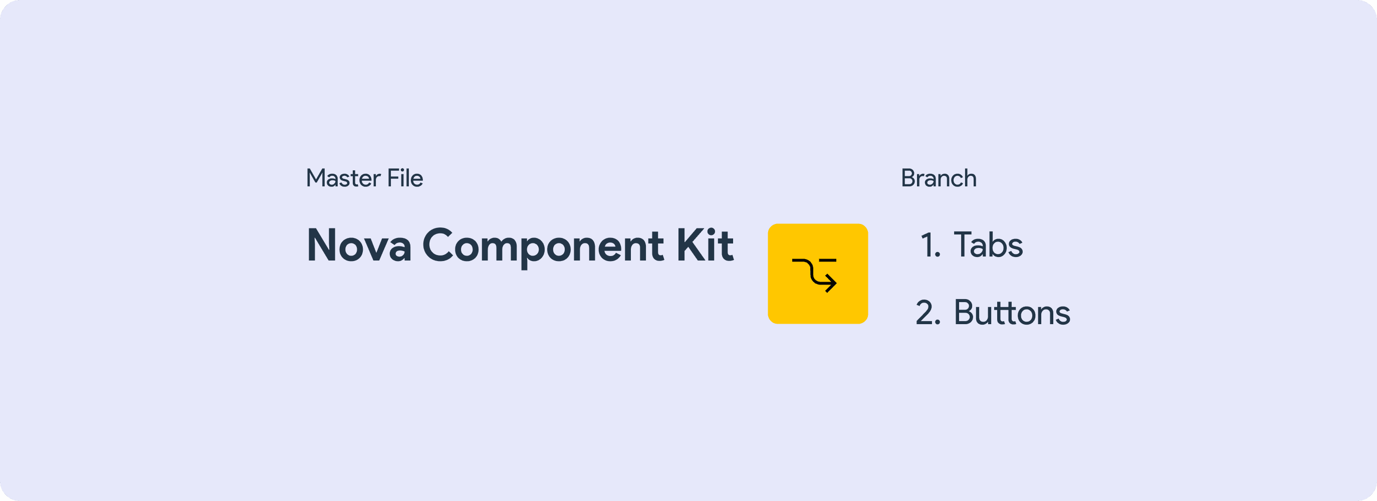
Working in a branch
Working in a branch makes sure that no unwanted changes can occur, which can cause problems, and also allows us to track systematically the progress and update of Nova.

Creating the atoms by utilizing variants & properties
Leveraging Figma's variants and properties feature, I crafted the foundational atoms of our design system. This approach enabled us to establish customizable and reusable design elements.
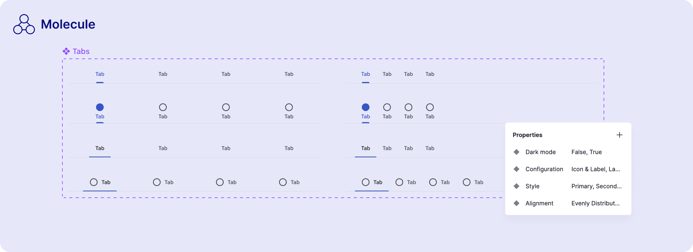
Turning atoms → molecules
Molecules in our interfaces are crafted by strategically combining atoms to function as cohesive units. These groupings serve as the backbone of our UI, facilitating more complex interactions and functionalities.

Building more complex components
I constructed organisms by assembling molecules, creating more complex and functional UI components. These organisms are designed to fulfill specific roles within the interface, enhancing the user experience through their integrated functionality.

Provide documentation & guideline
This documentation ensures that all team members understand the component's purpose, functionality, and application, guiding consistent implementation across our products.
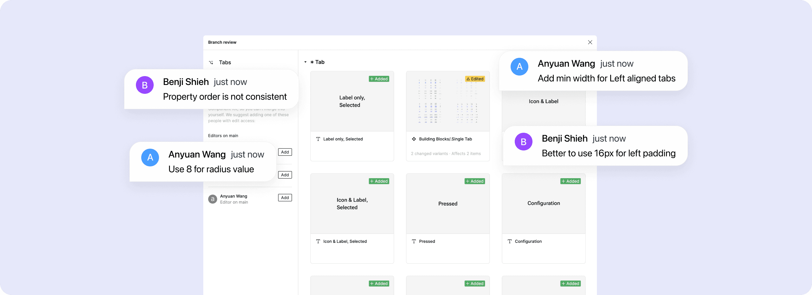
Send for review and reiterate based on feedback
Once done, I push my branch for review to other designers. Based on their feedback and comments, I then refine and iterate the component, ensuring it aligns with our standards and expectations before merging it.

Once everything’s aligned: Merge & publish!
And voila! We’re now one component closer to achieving full design maturity.
Components
Example of some components I published.

Tabs
Tabs organize content across different screens and views. Use tabs to group content into helpful categories.
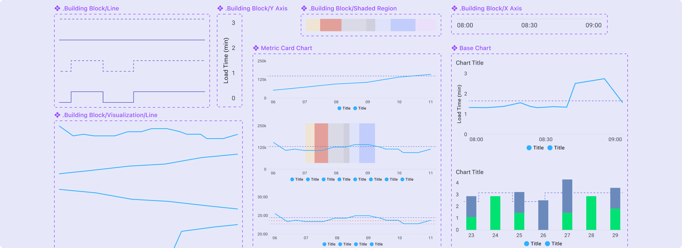
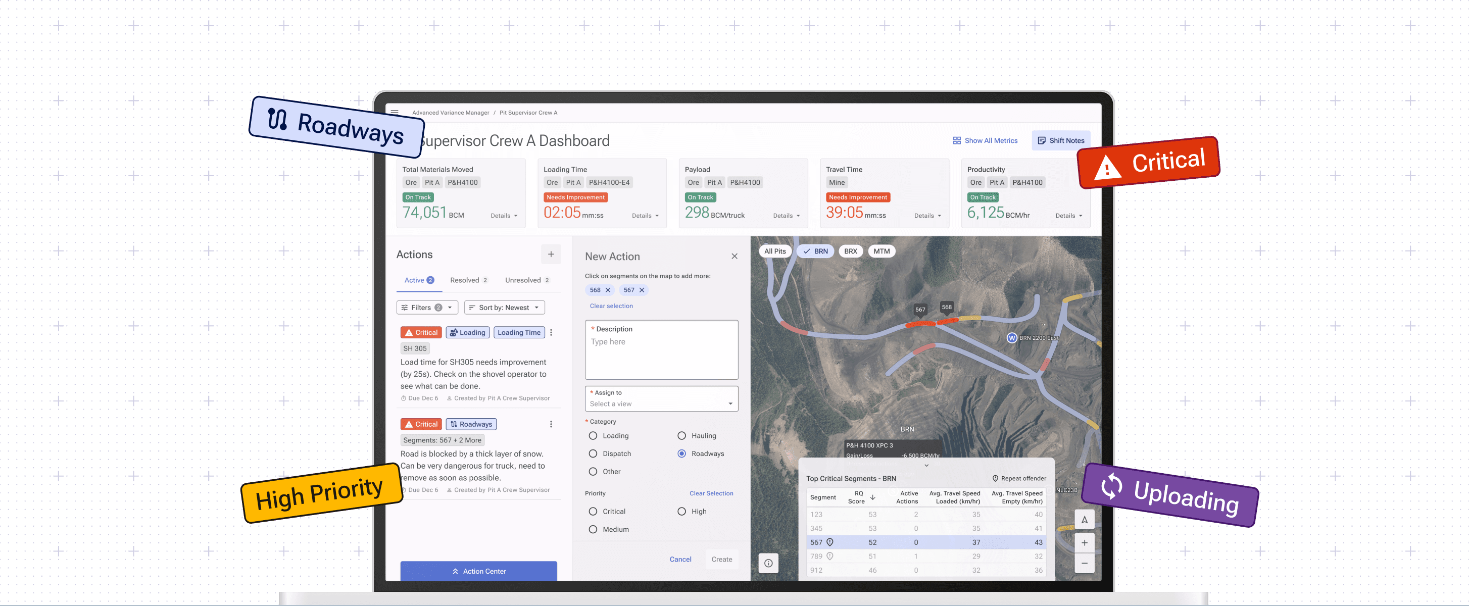
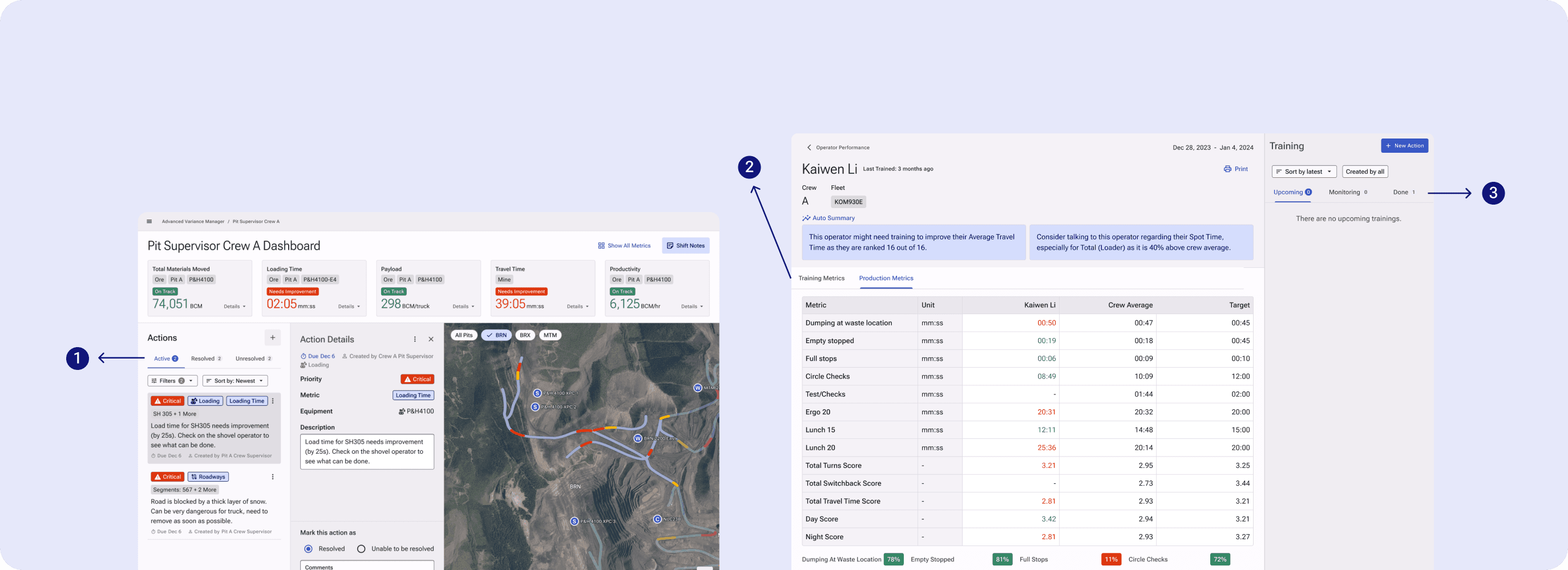
Chart & Visualization
This component is used to present complex data in an intuitive and engaging manner, allowing users to easily understand trends, patterns, and insights.
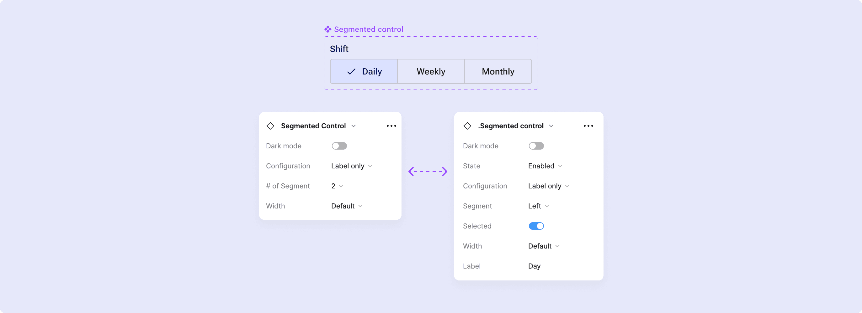
Segmented Control
Segmented control help people select options, switch views, or sort elements. It is used for simple choices between two to five items.

Chips
Chips can be used to inform the user of something that needs the user’s attention. They can also be used on their own to categorize items.
Impact
All major digital products at Teck are now developed using Nova as the foundational design standard.

100x YoY Growth in Usage
The concerted effort to mature Nova culminated in widespread organizational endorsement, reaching from the design floor to management levels. This milestone marks a significant leap in acceptance and commitment across the company, signaling Nova's pivotal role in our design and development process.
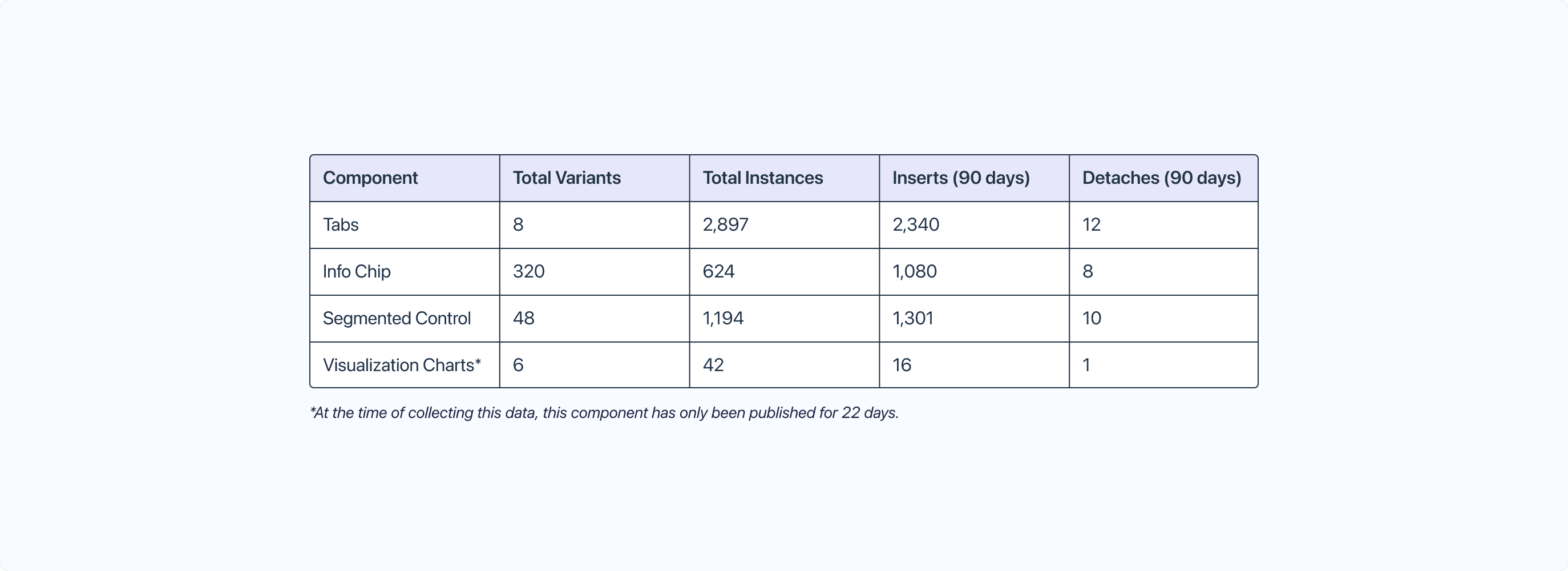
Averages less than 2% detaches on the components that I’ve built
This indicates that the components I published are versatile enough to be used as-is by designers, negating the need for manual adjustments and detaches.
And most importantly: it saves designers’ tons of time and increases our product’s cohesiveness!
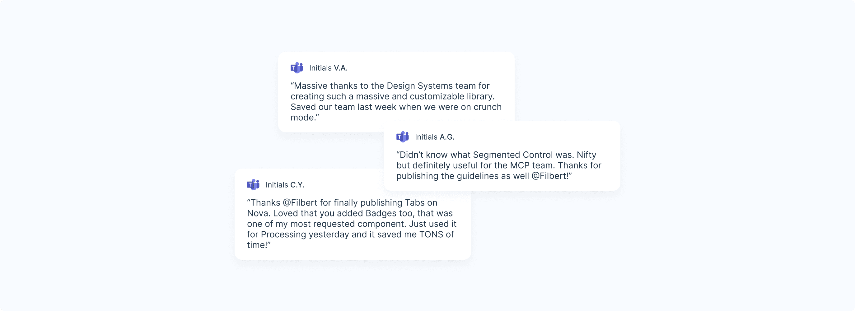
Feedback from my peers during the weekly design system release sessions has been overwhelmingly positive, highlighting the significant time savings and enhanced consistency across our products thanks to the newly introduced components.